
Typography
Typography guidelines ensure that we maximize legibility and maintain visual hierarchy throughout all of our content and documents.
Fonts
The primary fonts used by the Office of Advocacy are Source Sans Pro and Merriweather. Advocacy templates have Source Sans Pro and Merriweather pre-loaded and placed, as necessary. Individual staffers are encouraged to use the fonts as they see fit. If there are any questions about visual design, please contact the Visual Information and Web Manager, Keisha White.
If you are on a computer that does not have Source Sans Pro or Merriweather installed, and you cannot reach the Office of Communications to switch to the preferred fonts, please use Helvetica Neue in place of Source Sans Pro and Georgia in place of Merriweather. The use of these fonts, such as Source Sans Pro or Merriweather, should be approved by the Office of Communications (COMMS).
Primary Typefaces
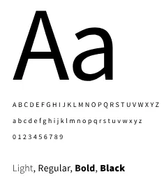
Source Sans Pro
Source Sans Pro is an open-source sans serif typeface created for legibility in UI design. With a variety of weights that read easily at all sizes, Source Sans Pro provides clear headers as well as highly readable body text.
Inspired by twentieth-century American gothic typeface design, its slender but open letters offer a clean and friendly simplicity. Advanced hinting allows Source Sans Pro to render well on Windows systems which run Cleartype, and across browsers and devices. Moreover, it supports a variety of languages and alphabets, including Western and European language, Vietnamese, pinyin Romanization of Chinese, and Navajo.
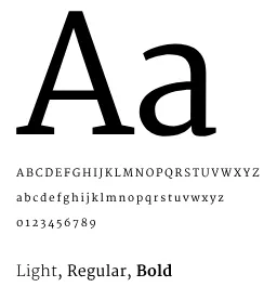
Merriweather
Merriweather is an open-source serif typeface designed for on-screen reading. This font is ideal for text-dense design: the letterforms have a tall x-height but remain relatively small, making for excellent readability across screen sizes while not occupying extra horizontal space.
The combination of light, regular, and bold weights gives the font family stylistic range, while conveying a desirable mix of classic, yet modern simplicity. Merriweather communicates warmth and credibility at both large and smaller font sizes.
Alternative Typefaces
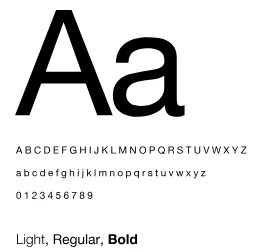
Helvetica Neue
Helvetica Neue is a reworking of the typeface Helvetica with a more structurally unified set of heights and widths. The font has a synthesis of aesthetic and technical refinements that result in improved appearance, legibility and usefulness.
In certain instances that Source Sans Pro may be unavailable, Helvetica Neue may be used if you have it installed on your computer system. This typeface may also be used in special circumstances, approved by INFO.
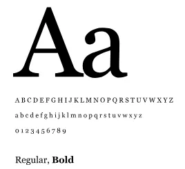
Georgia
Georgia is a typeface intended as a serif font that would appear elegant but legible printed small or on low-resolution screens. As a transitional serif design, Georgia shows a number of traditional features of ‘rational’ serif typefaces from around the early 19th century, such as alternating thick and thin strokes, ball terminals and a vertical axis.
If Merriweather is unavailable to use, Georgia (which is one of the most common system fonts available) may be used in its place. Use of Georgia over Merriweather must be approved by INFO.
Font Pairings and Styles
To support a more contemporary web and print design aesthetics, please adhere to the following font pairings.
Heading 1 – Source Sans Pro Regular or Semibold
Heading 2 – Source Sans Pro Regular or Semibold
Heading 3 – Source Sans Pro Semibold
Heading 4 – Source Sans Pro Semibold
Heading 5 – Source Sans Pro Semibold
Body copy – Source Sans Pro Regular
Readability and accessibility
Readable text allows users to efficiently read and take in textual information. Text that is not readable turns off readers or makes it challenging for them to stay focused. The following guidelines promote good readability and 508-compliance:
Readability
- Text should never be smaller than 13pt.
- Make sure there is a big enough size contrast between headings and main text (i.e., Headings can be 27pt and main text can be 14pt).
Accessibility
- Only use colors #223699 (SBA Blue), #1B1E29 (Onyx), or #000000 (Black) for main text. Inversely, you can use white text on SBA Blue, Onyx, or Black backgrounds.
- Do not use #969696 (SBA Grey) for text or as a background behind white text.
Type Hierarchy
One of the most important techniques for effectively communicating content is the use of typographic hierarchy. Using variations in size, weight, color and position of type, typographic hierarchy ensures that important information stands out, while less important details fade into the background. This not only makes the content more legible and easier to understand but also helps create a consistent and recognizable brand identity.
Previous