Logo System
The Advocacy logo system is comprised of horizontal lockups and various icons. Our Brand Assets include the Advocacy name and logos, and any other word, phrase, image, or other designation that identify the source of origin of any of Advocacy’s branding or products.
Primary Logos
Our primary brand assets are incredibly flexible and appropriate for most letterhead communications. The horizontal lockups are ideal on white or light gray backgrounds. Be mindful of the contrast against other background colors. For the purpose of accessibility and 508-compliance, prioritize the use of the single-color wordmark in instances that may negatively impact the contrast of the logo.
The primary logos can be accessed and downloaded by Advocacy employees via our SharePoint website.
Secondary Logos
Primary logos are always favored over secondary logos. Only use secondary logos for design challenges that cannot be solved with a primary logo.

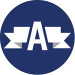
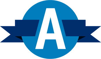
The secondary logos can be accessed and downloaded by Advocacy employees via our SharePoint website.
Clear Space
To make sure our logo is legible, and to maintain its integrity, keep the area surrounding it free of other elements. When placing any of the logos inside a container or pairing them with other design elements, make sure to give the logo a comfortable amount of white space to breathe.
Previous
Next